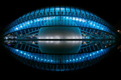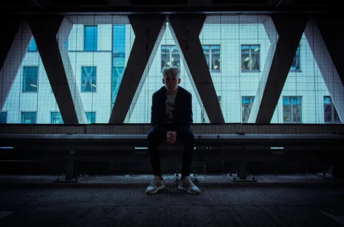
SnapRoamer.com – Centered composition and symmetry involve arranging a subject along a central axis to create balance, order, and harmony. While the Rule of Thirds often promotes movement, centered symmetry uses a subject’s reflection across a vertical or horizontal axis to establish a powerful, stable, and often formal visual impact. Glenn Guy notes that symmetry allows you to introduce a sense of order into a world of chaos.
The Symmetry Troubleshooting Guide: Fixing the ‘Almost Symmetrical’ Trap
To fix imperfect symmetry, address three main culprits: lens distortion, slight tilts, and uneven lighting. Use the ‘Transform’ or ‘Perspective’ tools in Lightroom to correct barrel distortion from wide-angle lenses, ensure your horizon is perfectly level, and balance visual weight by adjusting brightness or saturation if one side feels ‘heavier’ than the other.
According to digital-photography-school.com, symmetry is a compositional device featuring a subject reflected across an imaginary axis. If a photographer attempts to center a subject but fails to align the axis perfectly, the symmetry tends to fade into the background. This misalignment causes the subject to lose most, or all, of its inherent power.
Correcting Lens Distortion
wide-angle lenses often introduce barrel distortion, where straight lines appear to bow outward. In a symmetrical architectural shot, this curvature destroys the illusion of a perfect mirror image. To combat this, practitioners should utilize geometry correction tools to straighten these lines before the final export.
Balancing Visual Weight (Color vs. Geometry)
Geometry is not the only factor in balance. A photo can be geometrically perfect but visually “lopsided” due to color. For example, a bright red object on the left side of a symmetrical frame carries more visual weight than a muted blue object on the right. To fix this, you may need to adjust the saturation or brightness of specific regions to ensure the “weight” is distributed equally across the axis.
The Uncanny Valley of Near-Symmetry
There is a counterintuitive trap in symmetry: being “almost” perfect is often worse than being intentionally asymmetrical. A tilt of even 1 or 2 degrees in the horizon can make a symmetrical image feel broken rather than balanced. If the alignment is not precise, the viewer’s eye will focus on the error rather than the subject.
- Check for horizon tilt using the built-in leveler.
- Verify that the subject’s center point aligns with the frame’s center.
- Ensure lighting intensity is consistent on both sides of the axis.
Digital Correction Workflow: Perfecting the Axis in Post-Processing
Most classical buildings utilize symmetry in their facades to convey stability. Because achieving perfect alignment in-camera is difficult, digital tools are essential for refining the composition. Symmetry can be achieved through radial, vertical, horizontal, or reflective types, each requiring different correction approaches.
Using Lightroom’s Geometry Panel
The Geometry panel in Lightroom is the primary destination for fixing axis errors. By accessing the panel, you can use the “Upright” function to automatically correct perspective. For more manual control, the “Transform” sliders allow you to adjust vertical and horizontal alignment. A common mistake is over-correcting, which can lead to unnatural stretching of the subject.
Photoshop Perspective Warp for Architecture
For complex architectural shots where simple sliders fail, Photoshop’s Perspective Warp offers a more advanced solution. This allows you to define planes within the image, making it possible to correct the convergence of vertical lines in tall buildings. This is particularly useful when a wide-angle lens causes the top of a structure to appear to lean inward.
The Mechanics of Symmetry: Vertical, Horizontal, and Radial Types
symmetry in photography is categorized into four main types: Vertical (left-right mirroring), Horizontal (top-bottom mirroring), Radial (symmetry around a central point like a flower), and Reflective (mirroring via surfaces like water). Choosing the right type depends on whether your subject is an architectural facade, a landscape, or a macro subject.
As stated by digital-photography-school.com, “Symmetry is a compositional device that features a subject reflected across an imaginary axis.” Understanding the specific axis is vital for successful execution:
- Vertical Symmetry: The axis runs from top to bottom, creating a left-right mirror effect.
- Horizontal Symmetry: The axis runs from left to right, often seen in reflections on water.
- Radial Symmetry: The subject radiates from a single central point, common in nature.
- Reflective Symmetry: This uses a physical surface, such as a lake or a window, to create a secondary version of the subject.
Centered Composition vs. The Rule of Thirds
Photographers must decide between centering a subject or applying the Rule of Thirds. This decision dictates the emotional tone and visual flow of the final image.
| Criterion | Rule of Thirds | Centered Composition |
|---|---|---|
| Visual Feeling | Balance and movement | Static, clean, or impactful |
| Subject Focus | Distributed across the frame | Highly concentrated on one point |
| Best Aspect Ratio | Standard (4:3, 3:2) | 1:1 (Square) |
| Common Use Case | Landscapes, storytelling | Portraits, architecture, macro |
Relying on the Rule of Thirds by default can lead to sloppy compositions. This habit often results in placing the subject off to the side even when a centered composition would be more effective. However, the Rule of Thirds remains superior when you want to guide the viewer’s eye through a scene via leading lines.
When to Break the Rule of Thirds
Breaking the rule is necessary when the subject itself is the sole purpose of the image. If the surrounding elements are purely complementary, centering the subject provides a sense of monumental importance. This is frequently seen in the work of filmmakers like Wes Anderson, who is known for his heavy use of centralized composition.
The 1:1 Aspect Ratio Advantage
At 1:1 crops, center composition works best. The square format naturally draws the eye toward the middle, making symmetry feel more organic and less “crowded” than in a wide 16:9 cinematic format. In a 16:9 frame, a centered subject can sometimes feel isolated or lost in the vastness of the sides.
Mastering the Center: Techniques for Impactful Subjects
According to Anton Gorlin, a centered object is appropriate if the photo is about that subject solely and all other elements are complementary. To prevent the image from feeling static, photographers should introduce depth and contrast.
Effective centered photography relies on two primary techniques:
- Using Framing to Add Dimension: Find an object like a tree branch, keyhole, or fence to form a frame around the main subject. This adds layers to the image and provides context for the central subject.
- Figure-to-Ground Contrast: Separate the main subject from the background using contrast. This is achieved by placing a light subject on a dark background or a dark subject on a light background.
Without these elements, a centered subject can feel “stuck” in the middle of the frame. By using a frame, you create a path for the eye to follow from the edges of the photo directly to the center.
Intentional Imperfection: Using Symmetry Breaking for Narrative Tension
While perfect symmetry provides order, it can sometimes lack the energy required for compelling storytelling. If you want the power of symmetry while also gaining the dynamism of an off-center structure, you can employ “symmetry breaking.” This involves using a symmetrical scene but placing the primary point of interest slightly off the axis.
This technique allows you to maintain the structural integrity of the image while introducing a “hook” for the viewer. Instead of a perfectly balanced mirror, you create a tension between the expected order and the unexpected placement of the subject. This prevents the image from feeling static and boring, turning a formal composition into a narrative one.
FAQ
When should I use centered composition instead of the rule of thirds?
Use centered composition when the photo is solely about one subject and everything else is complementary, or when working with 1:1 aspect ratios. Use the rule of thirds when you want to create more movement and balance across a landscape or a complex scene.
Can symmetry make a photo look boring?
Yes, if elements are placed smack-dab in the center without enough contrast or context, the image can feel static and boring. To avoid this, use framing or off-center symmetry to add dynamism and prevent the eye from getting “stuck.”
How do I achieve perfect symmetry in architecture?
Physically adjust your position until standing directly in the center of a structure to ensure the halves align perfectly.